Trady — Design System & Process
Building a shared design foundation and a repeatable delivery workflow for a trading product.
I organised Trady's design work into a system and a process it could scale on — separating approved production work from exploration, rebuilding the component library, and leading a small team through a full brand and product redesign, with AI-assisted workflows built into how we started new screens.
View live product ↗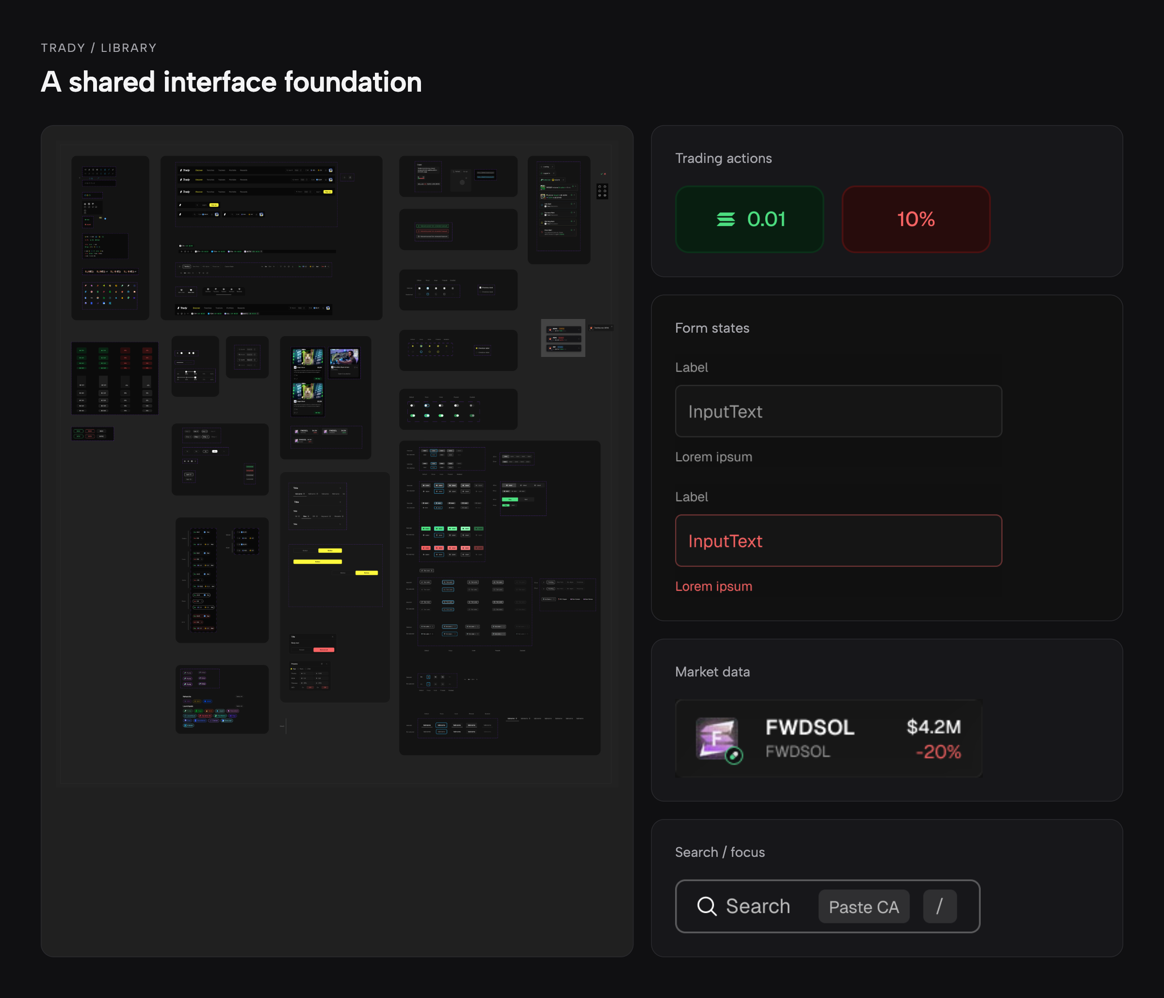
Trady is a Web3 trading terminal for discovering tokens, evaluating market information, and placing trades. When I joined, its design work had outgrown the way it was organised: product screens, library components, iterations, and active tasks all lived in one heavy Figma file. The file was slow, the library was hard to navigate, and approved designs were mixed in with unfinished work.
My work began with making that environment usable. Later, when the founder narrowed the product's focus to memecoin traders, the team needed to carry a new brand and interface through the same delivery process.
We needed to improve the design foundation while continuing to deliver product work. The challenge had three parts: separate approved work from exploration, rebuild an overgrown library around the product's actual needs, and coordinate a small team through a full redesign.
What I owned
I combined hands-on design with hiring, requirements clarification, task allocation, and quality reviews across the team.
What the CEO owned
The CEO owned product direction and final approval. I worked with him and the CTO to turn that direction into detailed, buildable designs.
Give work a clear place
I separated the original Figma file into Production for the latest approved designs and Sandbox / In Progress for active flows. Reusable library work was separated from product screens. Completed designs moved to Production after review, giving engineering a defined place to find approved work.
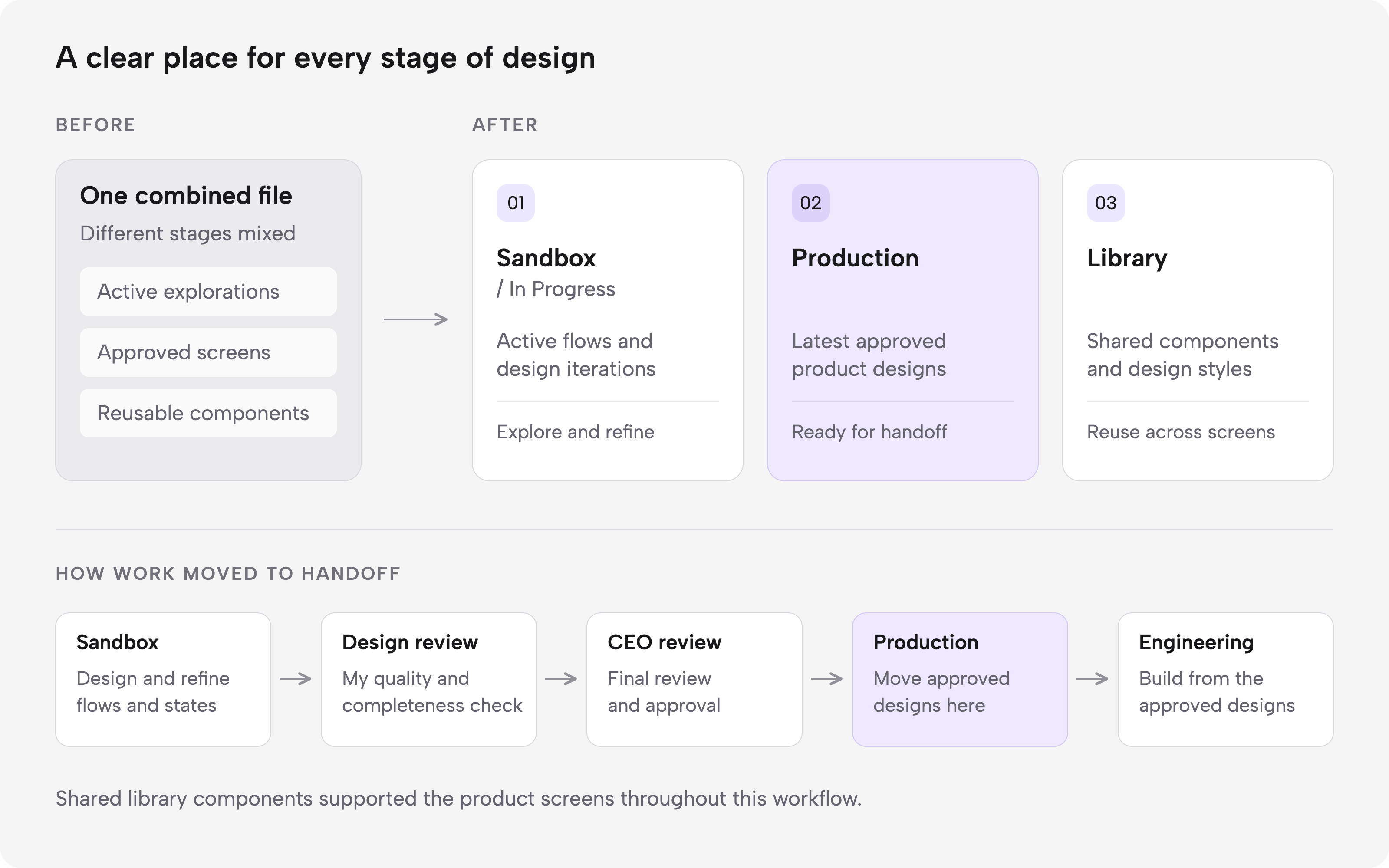
One heavy file split into three, each with a clear purpose — approved work, active work, and reusable components.
After the initial cleanup, I reviewed the existing scope with the CEO and CTO. We identified what was complete, missing, outdated, or needed further design work, alongside constraints from the backend and third-party integrations.
Connect ownership, review and handoff
I hired two part-time senior designers, initially with separate responsibilities for the design system and product UI. As the redesign progressed, both contributed to the new interface alongside me.
We held two team syncs each week with the PM and a sprint review every two weeks. I reviewed each completed task before final CEO review, checking requirements, flow completeness, interaction states, and consistency.
Revision loops ran backward as needed — from Design Lead review to the flow owner, and from CEO review back to Design Lead review — until each stage was approved.
We prioritised business-critical flows and considered engineering lead time. Approved work went to development incrementally, with responsive layouts included in the delivery scope.
Rebuild the foundation, then adapt it to the new brand
System work began before the product pivot. A dedicated designer rebuilt tokens and components while the rest of us continued interface work. I contributed hands-on, clarified requirements, and reviewed the system as it developed.
When the product direction changed, we developed new brand concepts. After the CEO selected a direction, the system designer updated the colour and typography bindings to reflect it — giving the team a shared foundation to apply across the redesigned screens.
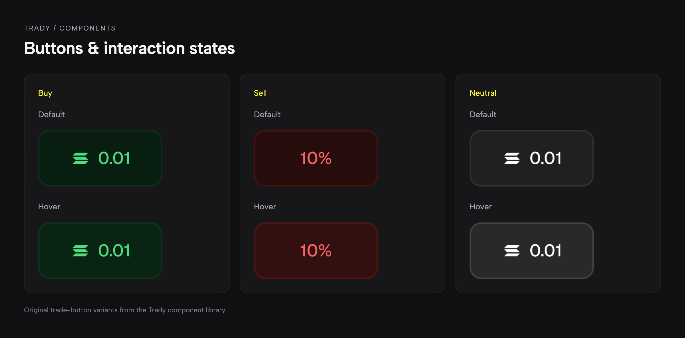
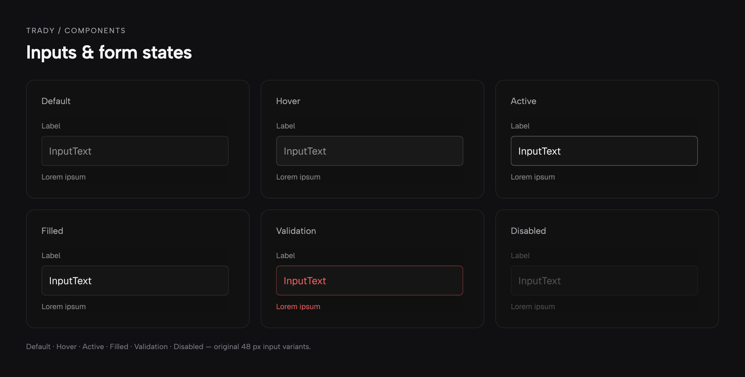
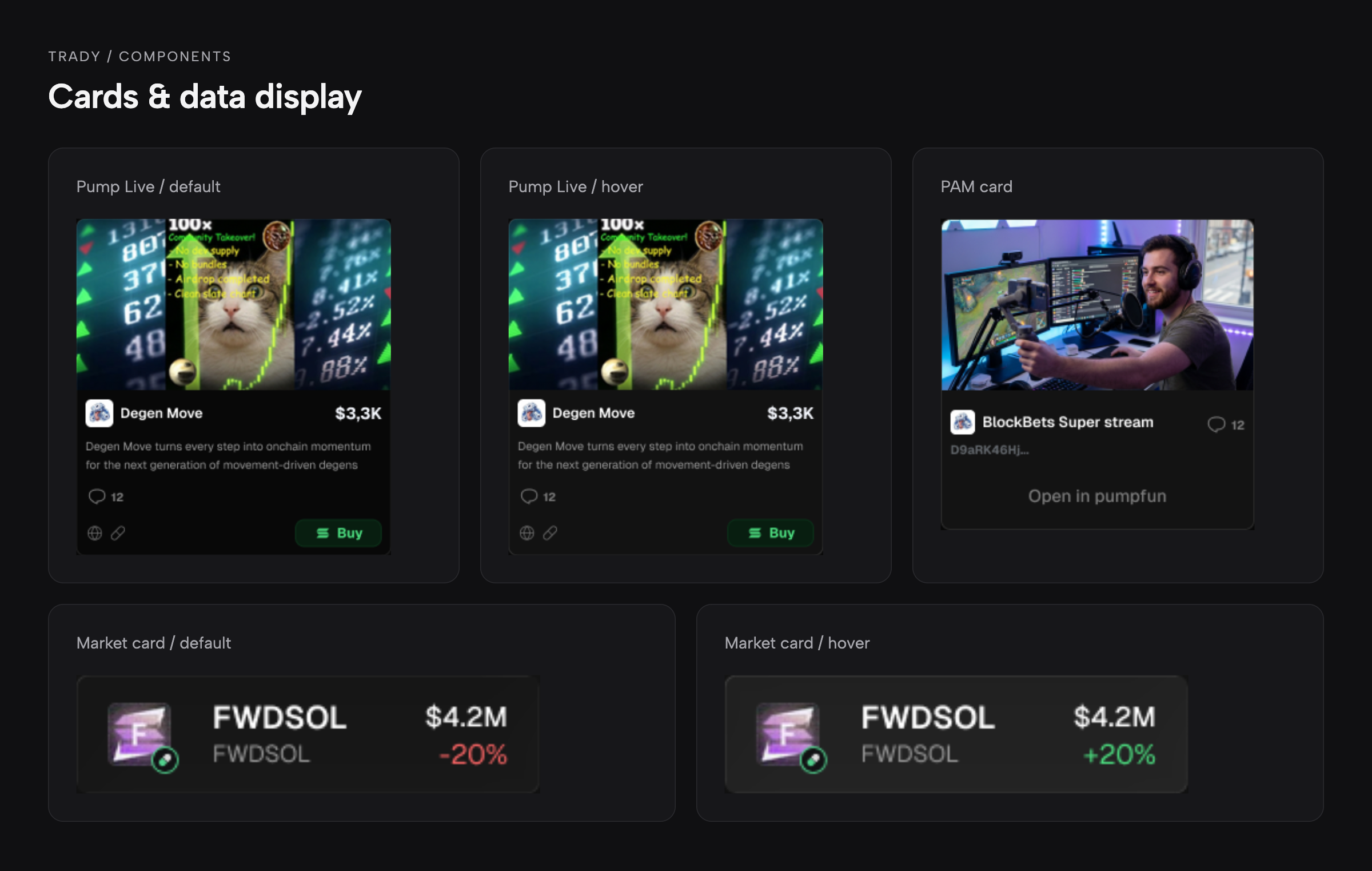
The resulting library was smaller and more focused on the interface we were actually building:
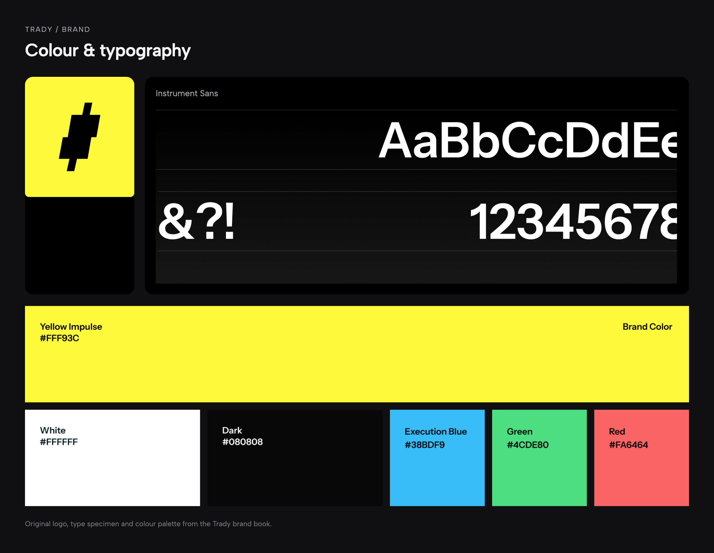
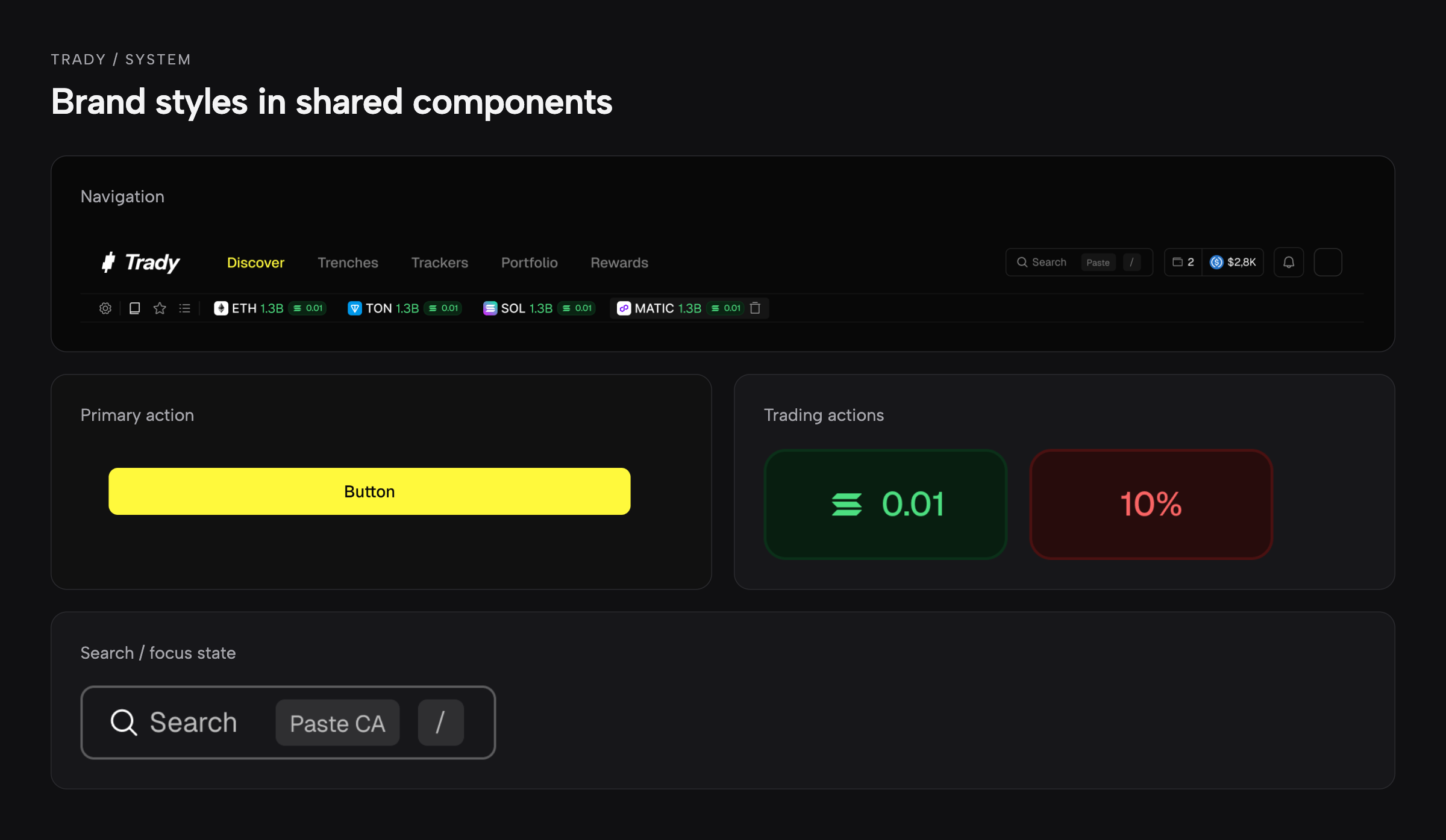
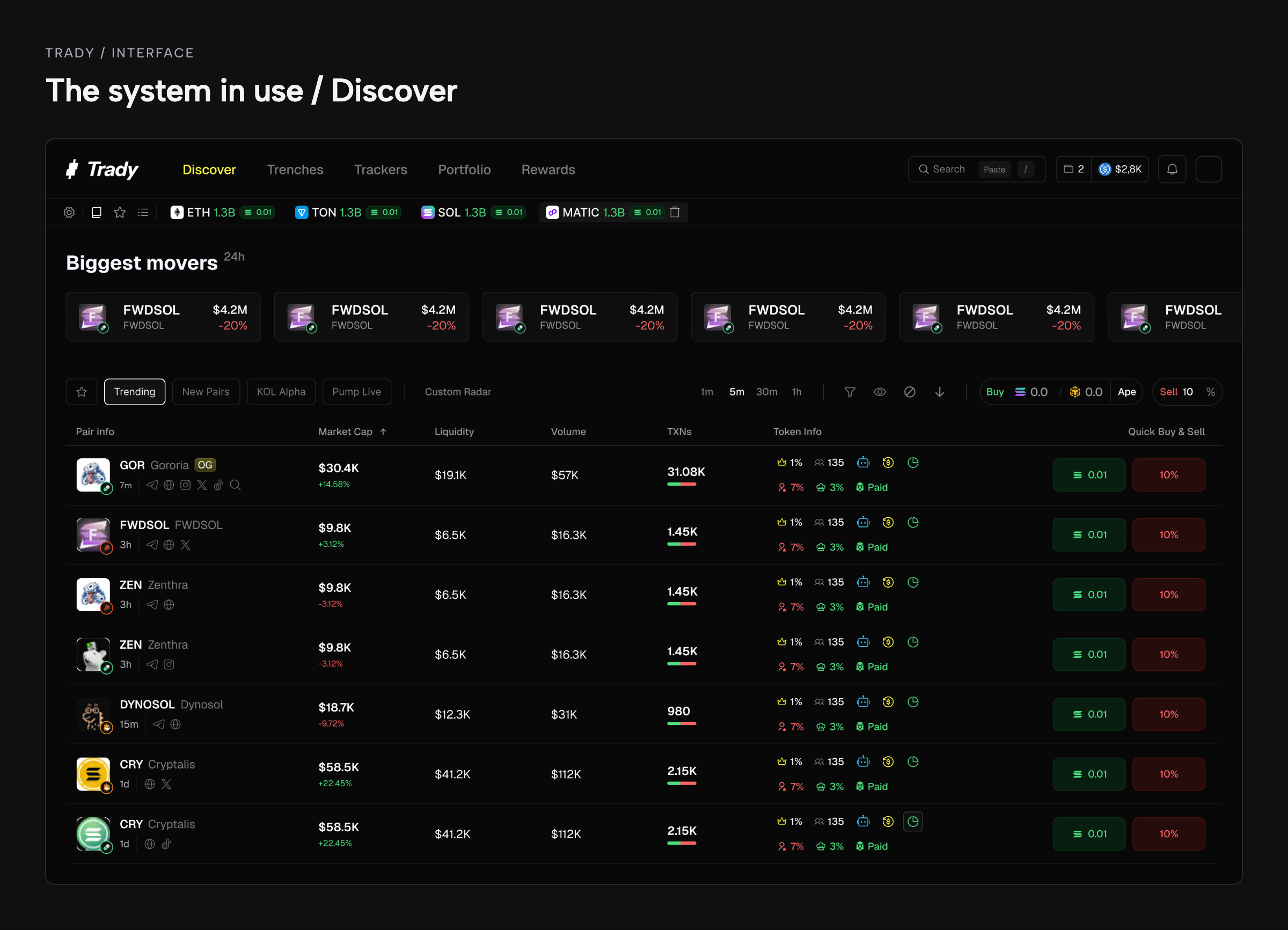
Approved brand styles carried through into components, then into the screens the team shipped.
Components and their states supported ongoing product work, and I reviewed their completeness alongside the flows that used them.
From an initial wireframe to a complete flow
The CEO used Claude to compare competitor screens and generate initial wireframes in Figma. I helped configure the project context with the approved brand direction, design system, competitor references, and audience description.
AI-generated layouts were a starting point, not a finished design — every wireframe went through team refinement and review before handoff.
Our team developed those starting points into detailed designs: applying the system, refining hierarchy, resolving interaction logic, and completing states. Complex trading screens required substantial manual work.
We also used Claude for smaller UI elements, including modals, pop-ups, dropdowns, and input states. These outputs went through design refinement and review before becoming part of the shared interface.
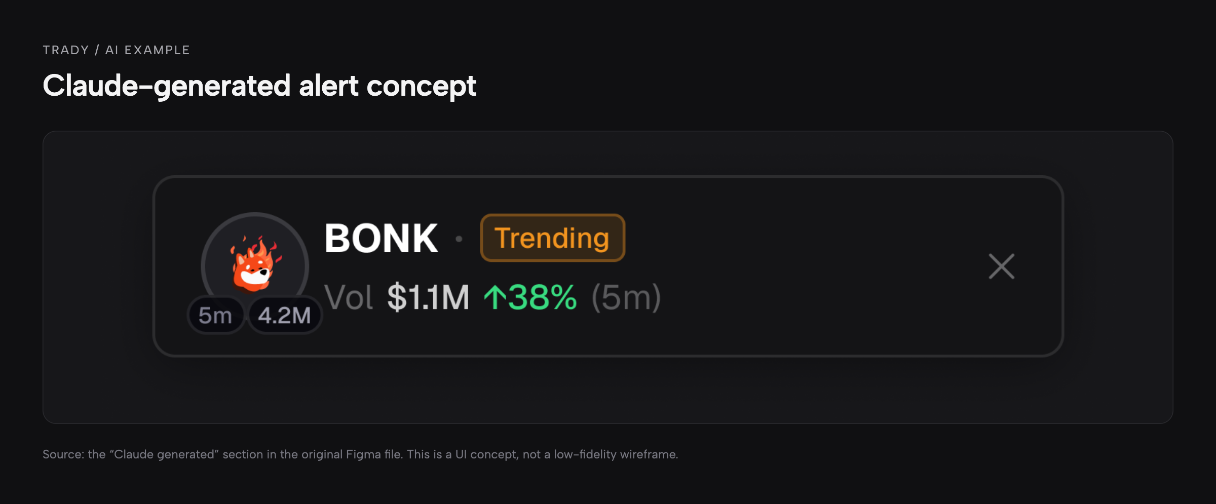
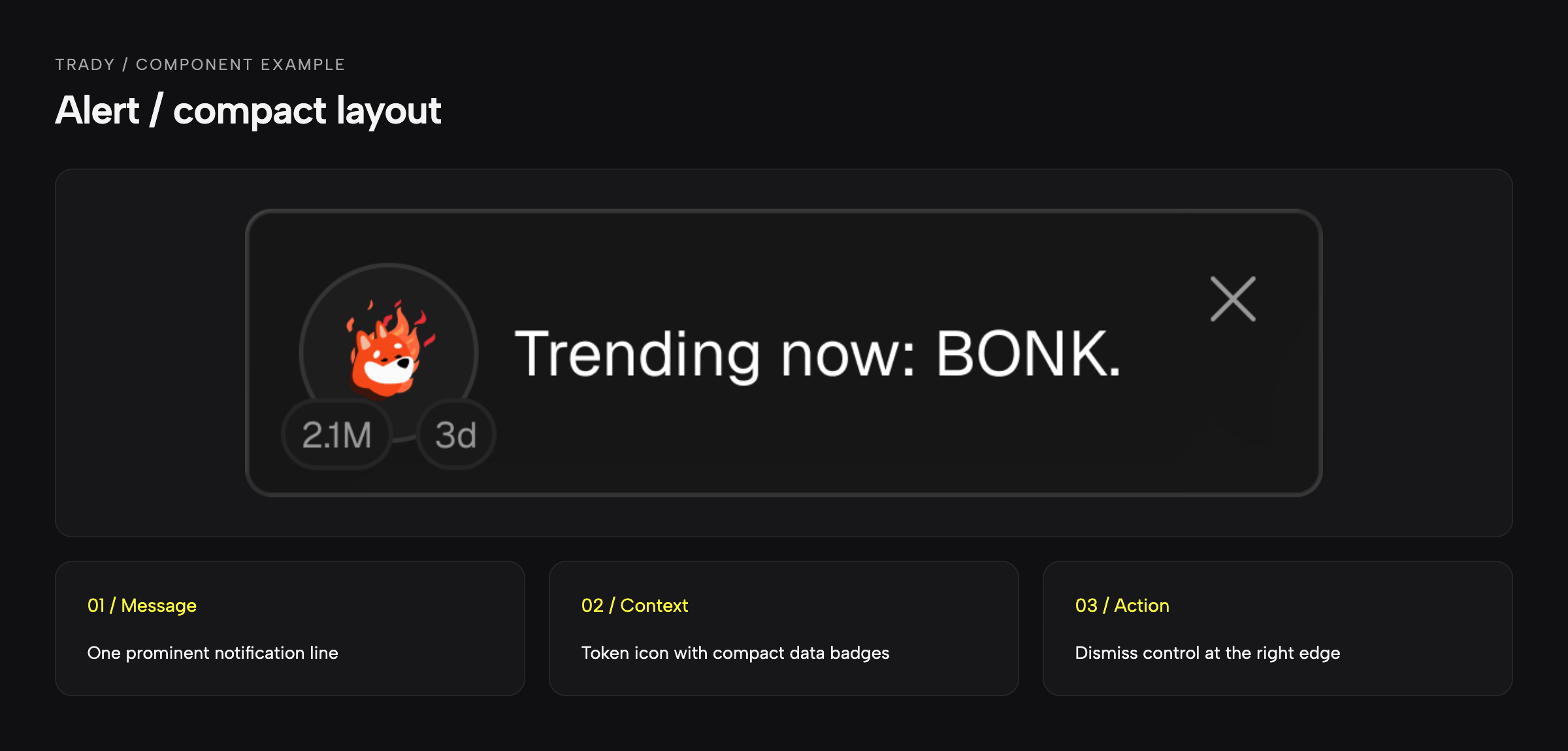
What changed in refinement: the token name, a separate trending badge, and a volume statistic became one prominent message line ("Trending now: BONK."); the data readout was reduced to two compact badges instead of three; the dismiss control stayed in the same position.
This workflow combined AI-generated starting points with explicit human ownership: the CEO set direction, designers developed the experience, and I reviewed quality and readiness for handoff.
The work left Trady with:
- Separate spaces for active work and approved production designs.
- A focused component library aligned with the new brand.
- A working review sequence from flow ownership through design and CEO approval to engineering handoff.
- Redesigned desktop flows and responsive layouts delivered incrementally.
- An AI-assisted workflow used for initial layouts and repeatable UI elements.
The full rebrand and redesign took approximately 1.5–2 months, and the redesigned product reached production. We did not measure the system's effect on delivery time or rework separately.
Takeaway
My main takeaway was to develop the system and the delivery process together. Shared components gave the team a common foundation; ownership and review determined how that foundation was applied. In a next iteration, I would track component reuse, review-to-handoff time, and recurring implementation issues to identify where the system needed further work.