Chromia Explorer
From transaction viewer to analytical product.
I led the redesign of Chromia Explorer, turning a basic transaction viewer into a connected product for discovering network activity, finding on-chain data, and investigating transactions. The redesigned experience is fully live on mainnet.
View live product ↗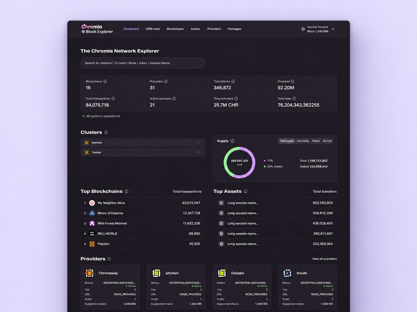
Chromia is a Layer-1 blockchain with a multi-chain architecture. Explorer makes its network activity visible to developers, dApp users, providers, and asset holders.
The existing product exposed data but offered limited search, shallow analytics, and fragmented navigation. As the ecosystem expanded, Explorer needed to support more than individual transaction lookups — it needed to make chains, assets, accounts, and governance activity discoverable within one coherent product.
The business objective was to support ecosystem growth through better developer experience and clearer network transparency. My design challenge was to deliver analytical depth without making everyday lookups unnecessarily complex.
I was the sole Product Designer across two successive team setups, owning the process from research and problem definition through information architecture, interaction design, final UI, and validation.
I worked with the PM and Product Owner on the initial scope, then continued the project directly with an Engineering Lead and a new development team. My design work focused on the dashboard, search, and transaction investigation.
The engineering team rewrote the backend, letting Explorer fetch substantially more on-chain data than before — their work, not mine.
I translated that expanded capability into clear dashboards, search flows, and richer transaction views.
I prioritised developers because transaction discovery and analytical depth were the strongest needs identified in the research. Simpler entry points served dApp users, while additional views supported providers, governance participants, and asset holders.
Initial research included five interviews with the internal team — PMs, developers, and the Head of Development — all working directly with Explorer. A product survey with 30+ respondents then explored users' needs, missing capabilities, and what to add, remove, or improve.
Initial survey findings, across 30+ respondents — separate answers to different questions, not shares of one total. They describe the surveyed users rather than the entire user base, and they informed priorities before the redesign, not outcomes after it.
After release, we ran a follow-up user survey to assess experience quality, perceived speed of accessing information, and data availability — a product-level evaluation, separate from the local usability tests used to compare design alternatives during the project.
Limited metrics, unclear cluster information, and weak entry points into the ecosystem.
I reorganised the dashboard around key network metrics, simplified cluster distribution, and introduced Top Blockchains and Top Assets. Clearer visual hierarchy separates the network overview from deeper information.
Users can begin with an ecosystem-level view, identify a relevant chain or asset, and move into its details — an entry point into analysis rather than an isolated status page.
The important shift wasn't adding more metrics — it was giving the data a useful order: overview first, relevant entities next, deeper investigation on demand.
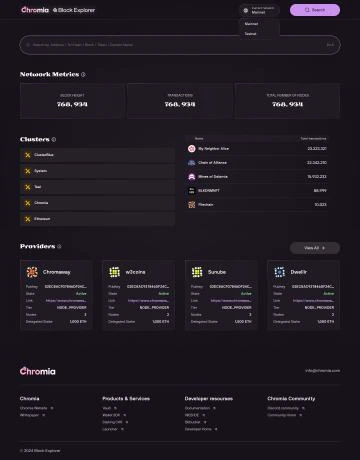
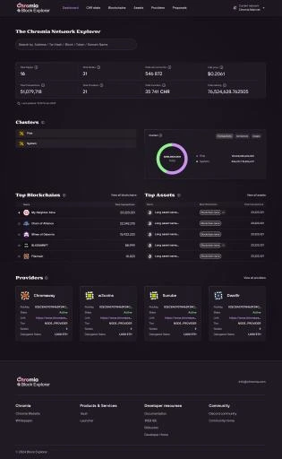
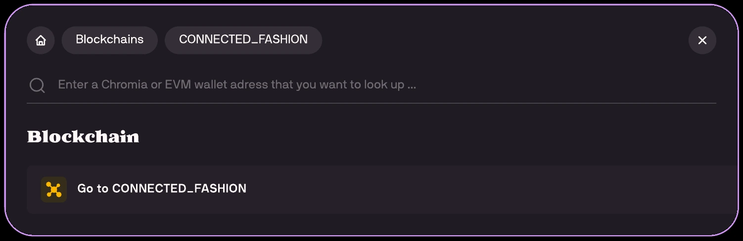
Search was unreliable and required users to understand the right category and context before beginning. The lack of a dedicated backend also limited what the interface could deliver.
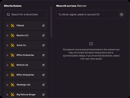
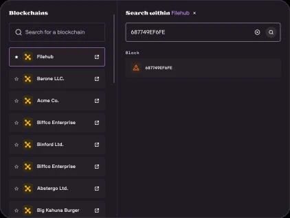
I designed two connected search modes: global search across the network and blockchain-specific search within a selected chain. A persistent blockchain panel provides context, direct navigation, and favourites for frequently used chains.
Users can start broadly or narrow the search to a known blockchain without rebuilding the journey, with access to a broader range of data made available by the backend rewrite.
Validation: we selected this format following limited usability testing with company employees who used Explorer but weren't directly involved in developing the product.
Before — a step-by-step lookup that required choosing the correct context first:
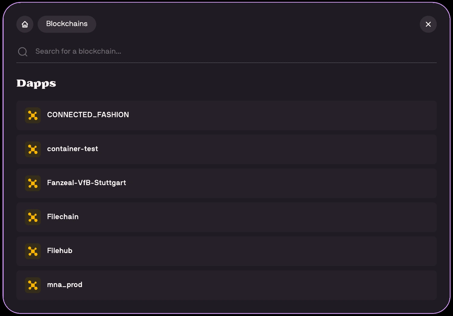
After — two connected modes, not a rebuilt journey:
Difficulty finding and navigating transactions was one of the main issues raised in the initial survey.
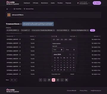
Users couldn't filter transactions by time or type and had to manually scroll through the list to find their transaction. The existing backend limited the available functionality.
Once the backend rewrite made these capabilities possible, I designed time-range and transaction-type filters, richer data tables, and structured pagination. Additional context — blockchain, block height, timestamp — supported more focused investigation.
Users can narrow the list to a relevant time window and transaction type instead of manually scanning unrelated records.
Validation: the initial survey established the transaction-discovery problem. A follow-up survey after release evaluated the updated Explorer as a whole, covering experience quality, perceived speed, and data availability.
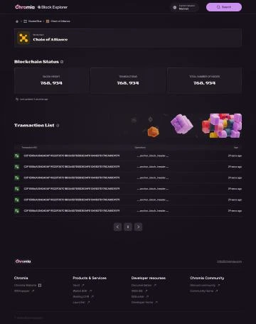
Beyond the three flows above, I extended the product structure with asset listings and details, network-wide Account and Signer pages, CHR metrics, and governance Proposals — aligned with the wider Chromia ecosystem's navigation and interface patterns, so different audiences get the information they need without separate, disconnected products.
Delivered: a fully released responsive web experience connecting network discovery, search, transaction filtering, assets, and governance.
Users can filter transactions by time and type, explore more on-chain data, and navigate between network-level and blockchain-specific views. A post-release user survey reviewed experience quality, perceived speed of accessing information, and data availability — its detailed results and sample size aren't published here.
Transparency is not about displaying more data. It is about helping people understand where to start, how information connects, and what to investigate next. The redesign's shared navigation and exploration patterns provide a foundation for extending Explorer as the ecosystem grows.